The Language of Color: Curating a Personal Palette That Speaks Before You Do

Photo: آرش کامروا, CC BY-SA 4.0, via Wikimedia Commons
Long before a word is spoken, color has already begun its work. The shade of a blazer, the depth of a trouser, the warmth or coolness of a chosen knit — each carries a psychological charge that registers with others in a fraction of a second. In contemporary fashion, color is not simply an aesthetic choice. It is a form of language, and like any language, it rewards those who learn to use it with precision.
At Suha Atiyeh, color is treated as a design element with the same weight as silhouette or fabric. Each collection is built around a considered palette that communicates a specific emotional and visual intention. The same discipline that applies to a collection can, and should, apply to a personal wardrobe. Understanding how to curate that palette — with awareness of psychology, personal identity, and practical lifestyle — is one of the most transformative investments a fashion-conscious individual can make.
Why Color Communicates What Words Cannot
The psychological study of color and human behavior has produced a substantial body of evidence over the past several decades. While individual and cultural associations vary, certain patterns hold with remarkable consistency across Western audiences.
Deep navy and charcoal convey authority, reliability, and quiet confidence — which is why they have long dominated professional American dress codes. Ivory and soft white signal clarity, openness, and a kind of considered ease. Burgundy and forest green carry warmth and depth, suggesting someone who is grounded and unhurried. Bright red commands attention and projects energy; it is a color that announces arrival rather than entry.
None of these associations are absolute, and personal context always inflects meaning. But awareness of these signals allows for intentional communication. When you understand what a color says, you can choose whether you want it speaking on your behalf on any given day.
The Wardrobe Audit: What Your Current Palette Reveals
Before building a new color story, it is worth examining the one already in place. A genuine wardrobe audit — not a casual glance, but a full assessment of every item by dominant hue — often reveals patterns that were not consciously chosen.
Consider two common profiles:
The Neutral Default: A wardrobe composed almost entirely of black, grey, and beige. This palette is safe, cohesive, and easy to dress — but it may also be communicating a reluctance to be seen. The individual wearing it may feel polished but rarely feels expressive. The wardrobe functions, but it does not speak.
The Reactive Accumulator: A wardrobe assembled from trend-driven color purchases — a cobalt top from two seasons ago, a mustard skirt that never quite paired with anything, a blush coat that felt right in the store. The palette is fragmented. Nothing coheres. Getting dressed feels like negotiating a series of mismatched signals.
Neither profile is a failure — both are simply starting points. The goal of a color audit is not judgment but clarity. Once you can see what your current palette is communicating, you can decide whether that message aligns with your actual identity and intention.
Building a Personal Color Story
A thoughtful personal palette typically operates on three levels: a foundation, a bridge, and an accent.
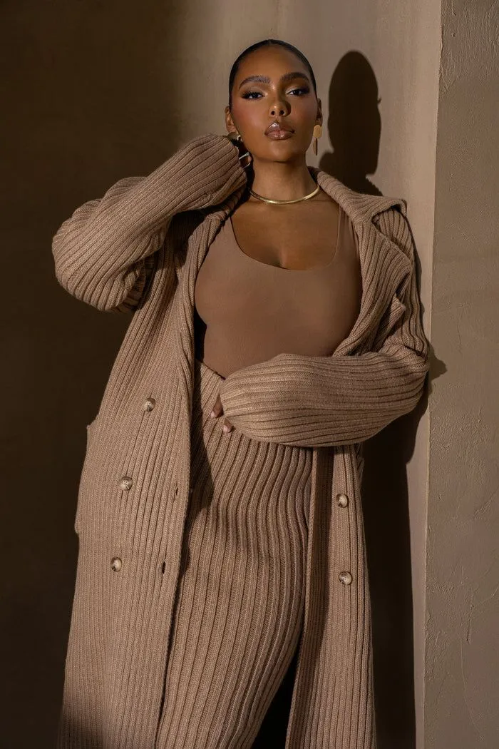
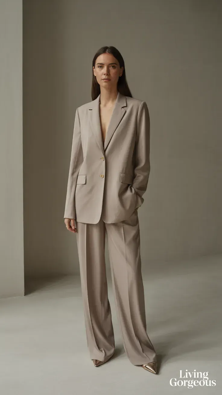
Foundation colors form the backbone of the wardrobe. These are the neutrals or near-neutrals that appear most frequently and carry the greatest number of pieces. They should feel intrinsically right against your skin tone and align with the primary contexts of your daily life. For someone in a creative industry in a city like New York or Los Angeles, a foundation in warm off-whites, soft taupes, and deep charcoals may feel both authentic and appropriate. For someone in a more corporate environment, navy, slate, and ivory may serve better.
Bridge colors are the mid-tones that connect foundation pieces to accent choices. Sage green, dusty rose, camel, and terracotta are examples of hues that carry enough character to feel intentional without demanding the full attention of an accent. These are the colors that make a wardrobe feel curated rather than merely collected. They allow the eye to move through an outfit with ease.
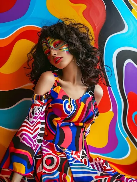
Accent colors are used sparingly and purposefully. A single piece — a structured bag, a silk scarf, a statement coat — in a bold or unexpected hue can define a personal aesthetic without overwhelming it. The key is restraint. One well-placed accent reads as confidence; several competing accents read as noise.
Before and After: The Impact of Intentional Curation
To illustrate the difference intentional color curation makes, consider two versions of a working wardrobe for the same individual — a professional woman in her mid-thirties, based in Chicago, who moves between a design studio and client meetings throughout the week.
Before: Her closet holds forty-seven items across at least twelve distinct color families. Getting dressed takes longer than it should and often ends in dissatisfaction. She reaches for the same three black pieces repeatedly because they are the only things that feel certain. The wardrobe does not reflect her — it reflects accumulated indecision.
After: Following a deliberate audit and a selective rebuilding, her wardrobe narrows to thirty-one pieces centered on a palette of warm ivory, slate blue, deep olive, and camel, with burgundy as a single accent color. Every piece communicates with every other. She can dress in under five minutes and feel entirely herself. Her colleagues notice a shift — not in the volume of what she wears, but in the clarity of how she presents.
The transformation is not about fewer clothes. It is about color coherence.
Aligning Palette With Season and Occasion
A sophisticated color wardrobe is not static — it shifts in depth and warmth across the year while maintaining its essential character. In autumn and winter, the palette deepens: the ivory becomes cream, the slate becomes charcoal, the olive darkens toward forest. In spring and summer, the same palette lightens and breathes: linen in pale sage, cotton in warm white, fine-knit layers in dusty mauve.
This seasonal evolution does not require a full wardrobe replacement. It requires a handful of seasonal additions that honor the established palette's logic. The result is a wardrobe that feels appropriate to its moment without ever losing its voice.
The Practice of Seeing Color Differently
Developing color literacy is a practice, not a single decision. It means pausing before a purchase to ask whether a new color genuinely extends your palette or simply interrupts it. It means noticing which hues consistently make you feel most aligned with yourself — not most fashionable, not most noticed, but most precisely you.
This is the standard by which every color decision at Suha Atiyeh is made: not what is trending, but what is true. A palette built on that foundation does not just dress a body. It tells a story.